react-native-modern-elements
Modern, customizable, and production-ready UI components for React Native & Expo.

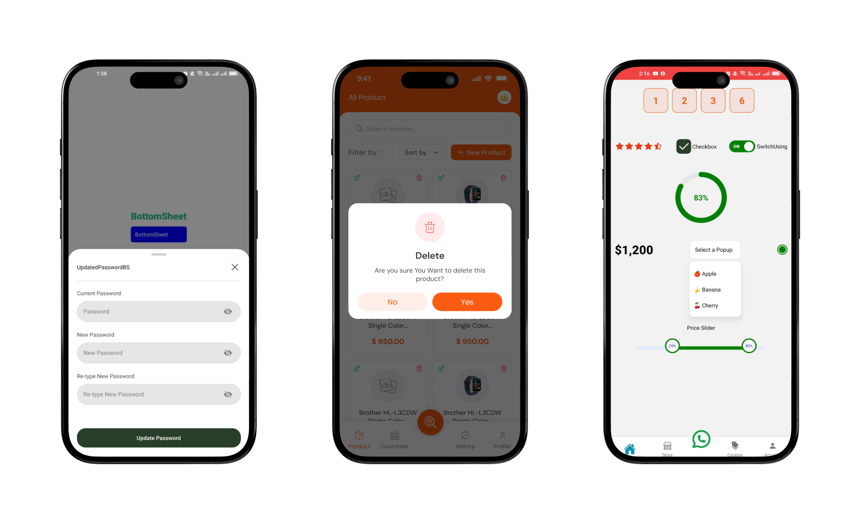
Demo Screenshot
Features
-
Built for Expo & React Native
-
Smooth animations
-
Fully customizable tabs and styling
-
Icon support for each tab
-
Dynamic width ratio support
🐱🏍 Coming Soon
🔄 Exciting new features are on the way!
🛠️ Planned updates include fresh hooks and components with improved performance.
- Data Fetching usePaganation hook
- Carousel
- ImageStack
- Tabs
Connect with me
Best Practices
. If you encounter an error, stop the Terminal and run the project again.
Components List
. [✅] Modals
. [✅] BottomSheet
. [✅] SelectList
. [✅] Popup
. [✅] RangeSlider
. [✅] RadialProgress
. [✅] RadioCircle
. [✅] Table
. [✅] OTPInput
. [✅] Toast
. [✅] InternetStatusToast
. [✅] Input
. [✅] Button
. [✅] CheckBox
. [✅] Switch
. [✅] StarRating
. [✅] NumberCount
. [✅] Typo
. [✅] Divider
. [✅] useBackExit
. [✅] useScrollShadowAnimation
. [✅] TabSlider
. [✅] ExpandableText
Installation
npm install react-native-modern-elements
yarn add react-native-modern-elements
🧪 Example Usage
Modals Usage
import React from "react";
import { TouchableOpacity, View, Text } from "react-native";
import { Modals } from "react-native-modern-elements";

const ModalsUsing = () => {
  const [modalVisible, setModalVisible] = React.useState(false);
  const handleShowProduct = (product: any) => {
    setModalVisible(product);
  };
  return (
    <View>
      <TouchableOpacity
        onPress={() => setModalVisible(true)}
        style={styles.openButton}
      >
        <Text style={styles.buttonText}>Open Modal</Text>
      </TouchableOpacity>
      <Modals
        visible={modalVisible}
        animation="LeftToCenterCloseToRight"
        onClose={() => setModalVisible(false)}
        modalContainer={{
          width: "90%",
          height: verticalScale(250),
          paddingHorizontal: verticalScale(20),

          paddingTop: verticalScale(20),
          paddingBottom: verticalScale(17),
        }}
      >
        <View style={{ alignItems: "center" }}>
          <View style={styles.header}>
            <TouchableOpacity onPress={() => setModalVisible(false)}>
              <Text className="font-bold text-3xl">X</Text>
            </TouchableOpacity>
          </View>
        </View>
        <View className="w-[150px]  h-[150px] rounded-full bg-secondary-light self-center flex justify-center items-center">
          <Text className="font-medium text-3xl text-center  text-white  ">
            Success
          </Text>
        </View>
        <Text className="text-center mt-4">
          Congratulations registration was successful
        </Text>
      </Modals>
    </View>
  );
};

export default ModalsUsing;

const styles = StyleSheet.create({
  header: {
    width: "100%",
    height: 40,
    alignItems: "flex-end",
  },
  openButton: {
    backgroundColor: "#F194FF",
    borderRadius: 20,
    padding: 10,
    elevation: 2,
  },
  buttonText: {
    color: "white",
    fontWeight: "bold",
    textAlign: "center",
  },
});
BottomSheet Usage
import { colors } from "@/src/constants/theme";
import { verticalScale } from "@/src/utils/styling";
import React from "react";
import { Text, TouchableOpacity, View } from "react-native";
import CancelIcon from "@/src/assets/svg/CancelIcon";
import {
  BottomSheet,
  BottomSheetHandle,
  Input,
  Divider,
  Button,
} from "react-native-modern-elements";

const BottomSheet = () => {
  const refScrollable = React.useRef<BottomSheetHandle>(null);
  const showUpdatedPasswordbs = () => {
    refScrollable.current?.open();
  };
  return (
    <View className="-mt-48">
      <TouchableOpacity
        onPress={() => refScrollable.current?.open()}
        style={{
          backgroundColor: "blue",
          padding: 10,
          borderRadius: 5,
          marginTop: 10,
        }}
      >
        <Text style={{ color: "white" }}>BottomSheet</Text>
      </TouchableOpacity>

      <BottomSheet
        ref={refScrollable}
        // snapPoints={snapPoints}
        snapPoints={["30%", "50%"]}
        draggable
        // dragOnContent
        closeOnPressBack={false}
        closeOnPressMask={false}
        wrapperColors={{ backgroundColor: "transparent" }}
        defaultOpen={true}
        showIndicator={true}
        mainContainer={{
          backgroundColor: "white",
          shadowColor: "gray",
          elevation: 20,
          shadowRadius: 10,
          borderTopRightRadius: 0,
          borderTopLeftRadius: 0,
        }}
        // openDuration={310}
      >
        <ViewWrapper
          style={{
            width: "90%",
            alignSelf: "center",
            //   height: verticalScale(440),
          }}
        >
          {/* header */}
          <View className="flex-row items-center justify-between">
            <Text>UpdatedPasswordBS</Text>
            <TouchableOpacity
              onPress={() => refScrollable.current?.close()}
              className="w-16 h-10 flex-row items-center justify-end "
            >
              <CancelIcon />
            </TouchableOpacity>
          </View>
        </ViewWrapper>
        <Divider align="center" mt={14} mb={20} bg={colors?.black_10} />
        <ViewWrapper
          style={{
            width: "90%",
            alignSelf: "center",

            height: verticalScale(335),
          }}
        >
          <View className="flex-col items-center justify-center gap-6">
            <Input
              lable="Current Password"
              lableStyle={{ color: colors?.black_70, fontSize: 14 }}
              placeholder="Password"
              secureTextEntry
              containerStyle={{
                borderRadius: 50,
                backgroundColor: colors.black_10,
                overflow: "hidden",
              }}
              iconStyle={{ marginLeft: verticalScale(4) }}
            />
            <Input
              lable="New Password"
              lableStyle={{ color: colors?.black_70, fontSize: 14 }}
              placeholder="New Password"
              secureTextEntry
              containerStyle={{
                borderRadius: 50,
                backgroundColor: colors.black_10,
                overflow: "hidden",
              }}
              iconStyle={{ marginLeft: verticalScale(4) }}
            />
            <Input
              lable="Re-type New Password"
              lableStyle={{ color: colors?.black_70, fontSize: 14 }}
              placeholder="Re-type New Password"
              secureTextEntry
              containerStyle={{
                borderRadius: 50,
                backgroundColor: colors.black_10,
                overflow: "hidden",
              }}
              iconStyle={{ marginLeft: verticalScale(4) }}
            />
          </View>
          <Button className="bg-primary py-4 rounded-3xl absolute bottom-0 w-full">
            <Text className="text-white font-medium">Update Password</Text>
          </Button>
        </ViewWrapper>
      </BottomSheet>
    </View>
  );
};

export default BottomSheet;
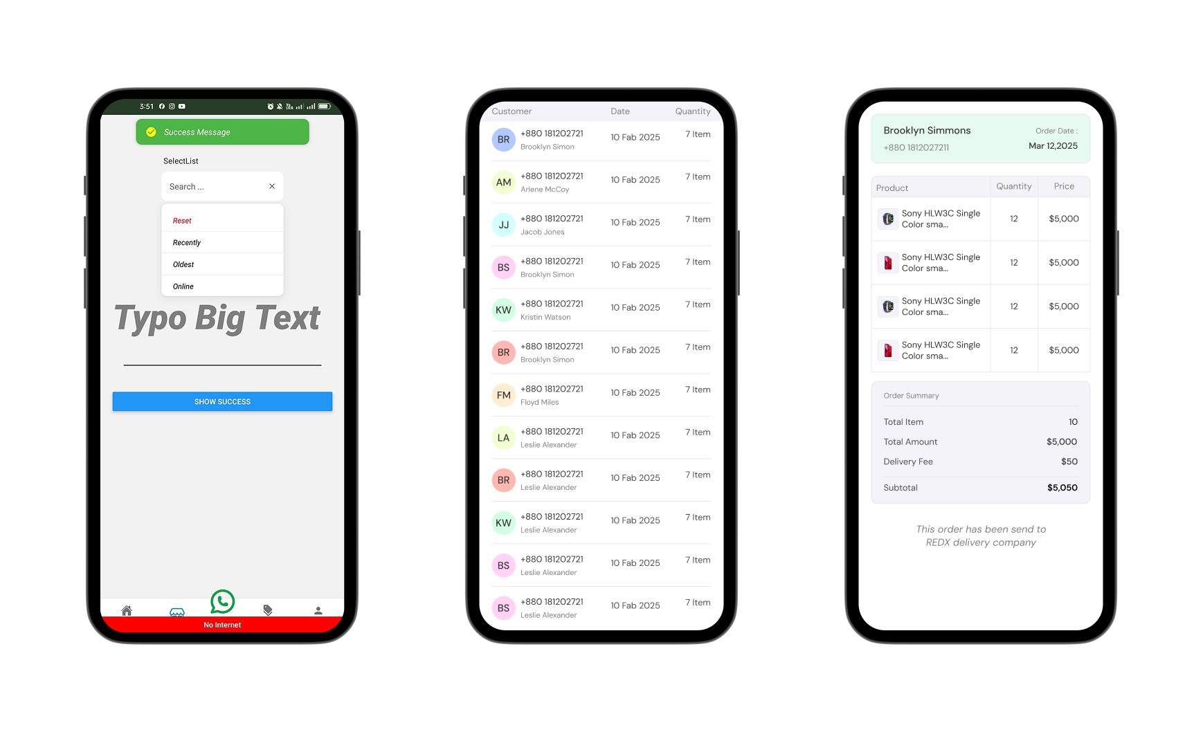
Table Usage
import { colors } from "@/src/constants/theme";
import React from "react";
import { Text, View } from "react-native";
import { Table, Divider } from "react-native-modern-elements";

const TableUsing = () => {
  const [data, setData] = React.useState<any[]>([]);
  React.useEffect(() => {
    const url = "https://api.escuelajs.co/api/v1/products";
    fetch(url)
      .then((res) => res.json())
      .then((data) => {
        const limitedData = data?.slice(0, 20);
        setData(limitedData);
      });
  }, []);

  return (
    <ScreenWrapper
      StatusBarColor={colors.green}
      barStyle="dark-content"
      style={{
        flex: 1,
        alignItems: "center",
        justifyContent: "center",
        padding: 16,
      }}
    >


     <Table
        height={500}
        borderColor={colors?.black_5}
        borderWidth={0.7}
        // Refreshing
        headerborderRight={true}
        cellRowBottomBorder={true}
        cellRowRightBorder={true}
        enableHeaderShadow={true}
        headerborderBottom={true}
        // showHeader

        tableStyles={{
          borderTopRightRadius: 10,
          borderTopLeftRadius: 10,
          borderBottomRightRadius: 5,
          borderBottomLeftRadius: 5,
          borderWidth: 1,
          borderColor: colors?.black_15,
        }}
        contentContainerStyle={{ paddingBottom: 200 }}
        divider={true}
        // dividerHeight={0.7}
        // dividerColors={colors?.black_5}
        dividerWight={"100%"}
        headerShadowStyle={{
          shadowColor: "purple",
          shadowOpacity: 0.3,
          shadowOffset: { width: 0, height: 3 },
          shadowRadius: 5,
          elevation: 6,
        }}
        cellRowStyle={{
          paddingHorizontal: 10,
          paddingVertical: 10,
          flexDirection: "row",
        }}
        showsVerticalScrollIndicator={false}
        HeaderRowStyle={{ backgroundColor: colors?.black_10 }}
        headerTexts={{
          fontSize: 16,
          fontWeight: "500",
          paddingVertical: 2,
          color: colors?.black_70,
        }}
        onRowPress={(item, rowIndex) => {
          router.push("/(screens)/(tabs)/account");
        }}
        // data={users}
        data={data}
        defaultAlign="left" // Global text alignment for all columns
        columns={[
          {
            label: "Product",
            key: "Product",
            // Control width of this column
            align: "left", // Override defaultAlign at the column level
            headerTextAlign: "left",
            render: (value, hello) => (
              <View
                style={{
                  flexDirection: "row",
                  alignItems: "center",
                  justifyContent: "center",
                }}
              >
                <ImageStack
                  maxDisplayImage={1}
                  images={hello?.images}
                  containerStyle={{
                    flexDirection: "row",
                    alignItems: "center",
                    justifyContent: "center",
                    gap: 5,
                  }}
                  imageWrapperStyle={{ borderRadius: 20 }}
                  imageContainerStyle={{
                    height: 25,
                    width: 25,
                    // borderRadius: 20,
                  }}
                />
              </View>
            ),
            headerStyle: {
              // backgroundColor: "#f0f8ff",
              flex: 3,
            },
          },
          {
            label: "Quantity",
            key: "email",
            align: "center", // Override defaultAlign at the column level
            // headerTextAlign: "left",
            headerStyle: {
              // backgroundColor: "#f0f8ff",
              flex: 2,
            },
            render: (value, row, rowIndex) => (
              <View
                style={{
                  flexDirection: "column",
                  alignItems: "center",
                  justifyContent: "center",
                }}
              >
                <Text style={{ textAlign: "center" }}>{row?.price}</Text>
              </View>
            ),
          },
          {
            label: "Age",
            key: "age",
            align: "center", // Override defaultAlign at the column level

            headerStyle: {
              // backgroundColor: "#f0f8ff",
              flex: 2,
            },
            render: (value, row, rowIndex) => (
              <View
                style={{
                  flexDirection: "column",
                  alignItems: "center",
                  justifyContent: "center",
                }}
              >
                <Text style={{ fontSize: 14, textAlign: "center" }}>
                  $5,000
                </Text>
              </View>
            ),
          },
        ]}
        summary={{
          align: "right",
          content: (
            <View
              style={{
                padding: 5,
                gap: 6,
              }}
            >
              <Text
                style={{
                  fontWeight: "400",
                  fontStyle: "italic",
                  fontSize: 18,
                  color: colors.black_50,
                }}
              >
                Summary
              </Text>
              <Divider width={"100%"} height={0.5} />
              <View style={{ gap: 3 }}>
                <View className="flex-row justify-between items-center">
                  <Text>Total Item</Text>
                  <Text>60 item</Text>
                </View>
                <View className="flex-row justify-between items-center">
                  <Text className="text-black-70">Total Item</Text>
                  <Text>$20,000</Text>
                </View>
              </View>
            </View>
          ),
          style: {
            backgroundColor: colors.black_10,
            width: "80%",
            // height: 300,
            borderRadius: 10,
          },
        }}
      />
      <View className="py-3 px-3 bg-white">
        <Text>hello</Text>
      </View>
    </ScreenWrapper>
  );
};
export default TableUsing;
OTPInput Usage
import { OTPInput } from "react-native-modern-elements";
const [otp, setOtp] = useState<number | null>(null);
<View>
  {/*  OTPInput component updates the `otp` state correctly */}
  <OTPInput length={4} setVerifyOtp={(val) => setOtp(parseInt(val.join("")))} />
</View>;
StarRating Usage
import { StarRating } from "react-native-modern-elements";

<StarRating
  rating={4.6}
  size={20}
  startgap={2}
  activeStartColor={colors?.rose}
  inActiveStartColor={colors?.green}
/>;
RadialProgress Usage
import { StarRating } from "react-native-modern-elements";
<RadialProgress
  percentage={50}
  Radialsize={150}
  strokeLinecap="round"
  strokeWidths={12}
  percentageTextSize={20}
  percentageTextFontWeight={"600"}
  animationDuration={1000}
  color={{
    high: "green-medium",
    low: "red",
    medium: "yellow",
    veryHigh: "green",
  }}
/>;
NumberCount Usage
import { NumberCount } from "react-native-modern-elements";
<NumberCount
  end={930000}
  formatPrice
  locale="en-US"
  prefix="$"
  style={{
    fontSize: verticalScale(28),
    fontWeight: "800",
    color: colors?.black,
  }}
/>;
SelectList Usage
import { SelectList } from "react-native-modern-elements";
const [selected, setSelected] = React.useState<string | null>(null);
const data = [
{
key: "1",
value: "desc",
modallable: "Recently",
icons: <CheckboxIconSvg />,
},
{
key: "2",
value: "asc",
modallable: "Oldest",
icons: <CheckboxIconSvg />,
},
];
const handleSelectItem = (item: string) => {
setSelected(item);
};
<View className="w-[50%]">
<SelectList
lable=" SelectList"
searchPlaceholder="Search ..."
// maxHeight={300}
// setSelected={(val) => setSelected(val)}
setSelected={handleSelectItem}
fontFamily="lato"
data={data as any}
DefaultTitle="Sort by"
maxHeight={160}
Reset
selectedIcons={false}
searchicon={false}
search={true}
dropdownTextStyles={{ fontStyle: "italic" }}
dropdownItemStyles={{
paddingHorizontal: 20,
paddingVertical: 10,
borderBottomColor: colors?.black_10,
borderBottomWidth: 0.7,
}}
InputboxStyles={{
borderRadius: 10,
height: 50,
backgroundColor: colors?.white,
paddingHorizontal: 10,
}} //override default styles
// defaultOption={{ key: "1", value: "Sort by" }} //default selected option
onSelect={() => {}}
save="value"
dropdownShown={false}
dropdownShadow={true}
/>
</View>;
import { Popup } from "react-native-modern-elements";

const [selected, setSelected] = React.useState<string | null>(null);
const handleSelectItem = (item: string) => {
  console.log("handleSelectItem", item);
  setSelected(item);
};
<Popup
  data={[
    { key: 1, value: "Apple", modallable: "🍎 Apple" },
    { key: 2, value: "Banana", modallable: "🍌 Banana" },
    { key: 3, value: "Cherry", modallable: "🍒 Cherry" },
  ]}
  save="key"
  setSelected={(val) => handleSelectItem(key)}
  setSelected={(val) => setSelected(val)}
  save="value"
  maxHeight={130}
  // maxWidth={150}
  // gap={8}
  //   popupShown={dropdownShown} // pass state down
  // setPopupShown={setDropdownShown} // pass updater
  popupShadow={true}
  animation="updown"
  popupBoxStyle={{
    paddingVertical: 0,
    paddingHorizontal: 0,
    // backgroundColor: colors?.green,
  }}
  renderButton={(toggle, selected) => (
    <TouchableOpacity
      onPress={toggle}
      style={{
        flexDirection: "row",
        width: 120,
        height: 45,
        alignItems: "center",
        justifyContent: "space-between",
        padding: 12,
        backgroundColor: "#fff",
        borderWidth: 1,
        borderColor: "#ddd",
        borderRadius: 8,
      }}
    >
      <Text>{selected || "Select a Popup"}</Text>
    </TouchableOpacity>
  )}
/>;
RadioCircle Using
import { RadioCircle } from "react-native-modern-elements";
const [isOn, setIsOn] = useState(false);
const [selected, setSelected] = useState("apple");
<RadioCircle
value="apple"
selected={selected}
onSelect={setSelected}
circleSize={24}
circleColor="green"
selectedColor="green"
activeDotSize={16}
containerStyle={{ marginVertical: 8, borderWidth: 1 }}
/>;
<RadioCircle
type="two"
value="Nizam"
selected={selected}
onSelect={setSelected}
circleSize={35}
circleBorderWidth={2}
circleColor="#ff0000"
selectedColor="#ff0000"
activeDotSize={24} // <-- control active dot width
containerStyle={{ marginVertical: 8 }}
/>
<RadioCircle
value="toggle"
type="one"
selected={isOn ? "toggle" : ""} // toggle selected state
onSelect={() => setIsOn(!isOn)} // flip state
circleSize={30}
circleBorderWidth={2}
circleColor={isOn ? "green" : "gray"}
selectedColor="green"
activeDotSize={18}
containerStyle={{ marginVertical: 10 }}
/>;
Switch Usage
import { Switch } from "react-native-modern-elements";
<Switch
  // value={isActive}
  onValueChange={(newValue) => {
    //   toggleConnection(item?.id, newValue);
    //   revalidateManager.run(`/delivery-company`);
    console.log("newValue", newValue);
  }}
  // disabled={isActive === false ? false : !isActive ? true : false}
  activeColor="green"
  inactiveColor="gray"
  switchContainers={{
    width: verticalScale(55),
    height: verticalScale(25),
  }}
  switchCircle={{
    width: verticalScale(20),
    height: verticalScale(20),
  }}
  switchTexts={{
    fontSize: verticalScale(10),
    fontWeight: "800",
  }}
/>;
RangeSlider Usage
import { RangeSlider } from "react-native-modern-elements";

const MIN_DEFAULT = 500;
const MAX_DEFAULT = 10500;
const minRef = React.useRef(MIN_DEFAULT);
const maxRef = React.useRef(MAX_DEFAULT);
<RangeSlider
  sliderWidth={300}
  defaultLeftPercent={0.15} // 15%
  defaultRightPercent={0.7} // 70%
  min={MIN_DEFAULT}
  max={MAX_DEFAULT}
  mode="range"
  step={100}
  thumbStyle="two"
  thumbValue="Value"
  TrackthumbLabelBackgroundColor="green"
  textColor="blue"
  fontSize={10}
  TrackHeight={8}
  priceSymbols="#"
  trickBorderRadious={100}
  onValueChange={(range) => {
    minRef.current = range?.min;
    maxRef.current = range?.max;
  }}
/>;
InternetStatusToast and Toast and useBackExit usinge
🤳Your root layout using
import SplashScreenComponent from "@/src/components/splashScreen/SplashScreenComponent";
import { useFonts } from "expo-font";
import { Stack } from "expo-router";
import * as SplashScreen from "expo-splash-screen";
import { useEffect, useState } from "react";
import { View } from "react-native";
import {
Toast,
toastRef,
useBackExit,
InternetStatusToast,
} from "react-native-modern-elements";
SplashScreen.preventAutoHideAsync();
export default function RootLayout() {
useBackExit();
const [isSplashVisible, setSplashVisible] = useState(true);
const [fontsLoaded] = useFonts({
SpaceMono: require("../../assets/fonts/SpaceMono-Regular.ttf"),
});
useEffect(() => {
if (fontsLoaded) {
setTimeout(() => {
setSplashVisible(false);
SplashScreen.hideAsync();
}, 2500);
}
}, [fontsLoaded]);
if (isSplashVisible) {
return <SplashScreenComponent />;
}
return (
<View style={{ flex: 1 }}>
<Stack>
<Stack.Screen name="(tabs)" options={{ headerShown: false }} />
{/* <Stack.Screen name="(details)" options={{ headerShown: false }} /> */}
</Stack>
<>
<InternetStatusToast />
<Toast
ref={toastRef}
defaultAnimation="center"
top={50}
// customIcons={{
// success: <Success color={colors?.white} />,
// error: <ErrorIconSvg color={colors?.white} />,
// info: <InfoIconSvg color={colors?.white} />,
// }}
contentStyle={{ gap: 5 }}
width={300}
iconSize={20}
duration={50000}
maxHeight={400}
textStyle={{ fontStyle: "italic" }}
containerStyle={{
borderRadius: 10,
paddingHorizontal: 0,
paddingVertical: 0,
}}
iconColor="yellow"
/>
</>
{}
</View>
);
}
Toast Usage
import { toastRef } from "react-native-modern-elements";
const handleSubmit = async () => {
if (isOffline) {
ToastAndroid.show(
" Please connect your internet to continue",
ToastAndroid.SHORT
);
return;
}
const data = {
email: values.email,
password: values.password,
};
try {
setLoading(true);
const res = await loginServerAction(data as any);
if (res?.data?.accessToken) {
router.replace("/(screens)/(tabs)");
setLoading(false);
toastRef.current?.show(
"Login successfull",
"success",
"rightToCenterCloseRight"
);
} else {
handleApiError(res);
setLoading(false);
}
} catch (error) {
console.error("Error during form submission:", error);
}
};
CheckBox Usage
import { CheckBox } from "react-native-modern-elements";

const [checkedItems, setCheckedItems] = useState<{ [key: string]: boolean }>(
  {}
);
<CheckBox
  checked={isChecked}
  onChange={(val: boolean) => {
    setIsChecked(val);
  }}
  checkBoxStyle={{
    width: 40,
    height: 40,
    ...classComponent.borderStyle,
  }}
  iconSize={35}

  // text="Accept Terms"
/>;
Button Usage
import { Button } from "react-native-modern-elements";
<Button
  disabled={!isFormValid}
  onPress={handleSubmit}
  style={{
    backgroundColor: isFormValid ? colors.primary : colors.black,
    opacity: isFormValid ? 1 : 0.6,
    borderRadius: verticalScale(50),
    height: verticalScale(46),
  }}
>
  {loading ? (
    <View className="flex-row items-center justify-center gap-2">
      <ActivityIndicator color={colors.white} size="small" />
      <Typo fontWeight="600" color={colors.white} size={21}>
        Continue
      </Typo>
    </View>
  ) : (
    <Typo fontWeight="600" color={colors.white} size={21}>
      Continue
    </Typo>
  )}
</Button>;
Input Usage
import { Input } from "react-native-modern-elements";
<Input
  placeholder="Name"
  value={values.full_name}
  onChangeText={(value) => {
    handleChange("full_name", value);
    setRef("full_name", value);
    validateField(value);
  }}
  error={errors.full_name || ""}
  icon={<UserIconSvg color={colors.black_30} />}
  containerStyle={{
    borderRadius: 50,
    backgroundColor: colors.bgColors,
    overflow: "hidden",
  }}
  iconStyle={{ marginLeft: verticalScale(4) }}
/>;
TabSlider Usage
import { TabSlider } from "react-native-modern-elements";
<TabSlider
initialPage={0}
renderTabItem={({ tab, isActive, onPress }) => (
<TouchableOpacity onPress={onPress}>
<View
style={{
flexDirection: "row",
alignItems: "center",
paddingVertical: 12,
paddingHorizontal: 16,
borderRadius: 10,
backgroundColor: isActive ? "orange" : "#eee",
}}
>
{/* Label */}
<Text
style={{
color: isActive ? "white" : "black",
fontWeight: "600",
}}
>
{tab.label}
</Text>
{/* Tooltip (if exists) */}
{tab.tooltip !== undefined && (
<View
style={{
marginLeft: 8,
paddingHorizontal: 8,
paddingVertical: 2,
borderRadius: 14,
backgroundColor: isActive
? "white" // tooltipActiveColor alternative
: "orange", // tooltipInactiveColor alternative (match your design)
}}
>
<Text
style={{
color: isActive ? "black" : "white",
fontSize: verticalScale(11),
fontWeight: "600",
}}
>
{tab.tooltip}
</Text>
</View>
)}
</View>
</TouchableOpacity>
)}
variant="pill"
alignTabs="center"
// buttonStyle={{ backgroundColor: ac "black", paddingVertical: 14 }}
buttonTextStyle={{ color: "white" }}
buttonContainerStyle={{
marginHorizontal: 10,
}}
activeColor="green"
inactiveColor="white"
tooltipActiveColor="white"
tooltipInactiveColor="green"
// header={<View style={{ width: 20 }} />}
footer={<View style={{ width: 20 }} />}
tabs={[
{ label: "Newest", tooltip: 20 },
{ label: "Top Sell" },
{ label: "Popular" },
]}
>
<NewestPage />
<TopSellPage />
<PopularPage />
</TabSlider>
const styles = StyleSheet.create({
page: {
justifyContent: "center",
alignItems: "center",
},
pageText: {
fontSize: 24,
fontWeight: "bold",
},
});
ExpandableText Using
import { ExpandableText } from "react-native-modern-elements";
<ExpandableText
  textStyle={{
    fontSize: verticalScale(13),
    color: colors?.black_50,
    lineHeight: 23,
    letterSpacing: 0.9,
    textDecorationLine: "underline",
  }}
>
  Breathe elegance into your summer wardrobe with Zara’s Oversized Linen Blend
  Shirt in a gentle blush pink tone.
</ExpandableText>;


