
Security News
The Hidden Blast Radius of the Axios Compromise
The Axios compromise shows how time-dependent dependency resolution makes exposure harder to detect and contain.
By Ahmad Nassri - Apr 01, 2026
react-clock-select
Advanced tools
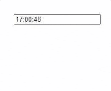
A simple react component to select or display time in 12 hour or 24 hours format.
A simple react component to select time or display time in 12 hour or 24 hours format

|

|
|

|
npm install react-clock-select
AnalogTime & DigitalTime .AnalogTime): import React from 'react';
import { AnalogTime } from "react-clock-select";
function TimePicker(props){
return(
<AnalogTime
type={"picker"}
// "picker" or "display", default is picker
value={new Date()}
// Date() object or
// a valid time string for Date() constructor
placeholder={"Select Time.."}
// when 'value' is empty string
hoursFormat={12}
// 12 or 24
size={1}
// greater than 0, Default is 1.
selectorPosition={"top"}
// "top", "bottom" or "modal" (Picker only).
// Default is bottom.
liveUpdater={true}
// true or false (Display only).
// Default is false.
baseColor={"rgb(255,255,255)"}
// Color value for clock base
hourHandColor={"white"}
// Color value for clock base
minuteHandColor={"#FFFFFF"}
// Color value for clock base
secondHandColor={"#4d944e"}
// Color value for clock base
onConfirm={(e,value)=>{
// "e" is the event object
// "value" is a JSON
// {
// time_string: "12:00:00 AM",
// hours: "12",
// minutes: "00",
// seconds: "00",
// am_pm: "AM",
// }
}}
/>
)
}
DigitalTime): import React from 'react';
import { DigitalTime } from "react-clock-select";
function TimePicker(props){
return(
<DigitalTime
type={"picker"}
// "picker" or "display", default is picker
value={new Date()}
// Date() object or
// a valid time string for Date() constructor
placeholder={"Select Time.."}
// when 'value' is empty string
hoursFormat={12}
// 12 or 24
size={1}
// greater than 0, Default is 1.
selectorPosition={"top"}
// "top", "bottom" or "modal" (Picker only).
// Default is bottom.
liveUpdater={true}
// true or false (Display only).
// Default is false.
color={"rgba(24, 24, 24, 0.671)"}
// Color value for clock digits
onConfirm={(e,value)=>{
// "e" is the event object
// "value" is a JSON
// {
// time_string: "12:00:00 AM",
// hours: "12",
// minutes: "00",
// seconds: "00",
// am_pm: "AM",
// }
}}
/>
)
}
AnalogTime):| Prop | Type | Description |
|---|---|---|
| type | String | "picker" for time picker display or "display" for non editable display |
| value | String/Date() | Sets default time value |
| placeholder | String | Set placeholder, visible when 'value' is empty string |
| hoursFormat | Number | Hour format can be either 12 or 24 |
| size | Number | Size of the clock, should be greater than 0, Default is 1 |
| selectorPosition | String | Position of the picker, "top", "bottom" or "modal" (Picker only). Default is bottom. |
| liveUpdater | Boolean | Live Clock, if "value" prop is provided live time will be initiated from the "value". |
| baseColor | String | Color value for clock base |
| hourHandColor | String | Color value for hour hand |
| minuteHandColor | String | Color value for minute hand |
| secondHandColor | String | Color value for second hand |
| onConfirm | Callback | Callback function for date confirm on OK button. value is a JSON { |
DigitalTime):| Prop | Type | Description |
|---|---|---|
| type | String | "picker" for time picker display or "display" for non editable display |
| value | String/Date() | Sets default time value |
| placeholder | String | Set placeholder, visible when 'value' is empty string |
| hoursFormat | Number | Hour format can be either 12 or 24 |
| size | Number | Size of the digital font, should be greater than 0, Default is 1 |
| selectorPosition | String | Position of the picker, "top", "bottom" or "modal" (Picker only). Default is bottom. |
| liveUpdater | Boolean | Live Clock, if "value" prop is provided live time will be initiated from the "value". |
| color | String | Color value for clock digits |
| onConfirm | Callback | Callback function for date confirm on OK button . value is a JSON { |
AnalogTime):Default CSS classes for easy css customization.
| ClassName | Description |
|---|---|
| rcs-analog-picker-custom | For analog picker container. |
| rcs-analog-clock-base-custom | For the base svg of analog clock. |
| rcs-analog-hour-hand-custom | For the hour-hand svg of analog clock. |
| rcs-analog-minute-hand-custom | For the minute-hand svg of analog clock. |
| rcs-analog-seconds-hand-custom | For the seconds-hand svg of analog clock. |
| rcs-analog-time-picker-form-container-custom | For analog picker container for inputs and button. |
| rcs-analog-time-input-field-parent-custom | For analog picker input fields container. |
| rcs-analog-time-input-field-custom | For analog picker input field. |
| rcs-analog-picker-input-custom | For the main analog picker input field. |
| rcs-analog-am-pm-toggle-custom | For analog picker am-pm toggle. |
| rcs-analog-time-picker-btn-custom | For analog picker confirm button. |
DigitalTime):Default CSS classes for easy css customization.
| ClassName | Description |
|---|---|
| rcs-digital-parent-custom | For main container. |
| rcs-digital-picker-custom | For digital picker and display container. |
| rcs-digital-picker-input-custom | For picker input fields. |
| rcs-digital-time-picker-btn-custom | For picker confirm button. |
For support contact: adnanali17official@gmail.com, daniyal_09.2005@hotmail.com
FAQs
A simple react component to select or display time in 12 hour or 24 hours format.
The npm package react-clock-select receives a total of 4 weekly downloads. As such, react-clock-select popularity was classified as not popular.
We found that react-clock-select demonstrated a not healthy version release cadence and project activity because the last version was released a year ago. It has 2 open source maintainers collaborating on the project.
Did you know?

Socket for GitHub automatically highlights issues in each pull request and monitors the health of all your open source dependencies. Discover the contents of your packages and block harmful activity before you install or update your dependencies.
Security News
The Axios compromise shows how time-dependent dependency resolution makes exposure harder to detect and contain.

Research
A supply chain attack on Axios introduced a malicious dependency, plain-crypto-js@4.2.1, published minutes earlier and absent from the project’s GitHub releases.

Research
Malicious versions of the Telnyx Python SDK on PyPI delivered credential-stealing malware via a multi-stage supply chain attack.